
Embracing constraints and raising the design bar
After identifying and solving for our most important UX challenges ahead of the launch of Movies Anywhere, we wanted to take our visual design to the next level. As we did a deeper dive into what we’d need to bring our vision to life, we were met with a variety of challenges and constraints that became the basis for some of our most innovate design solutions yet.
Client
Movies Anywhere
Role
Product design
High-fidelity prototyping
User research
User testing
Competitive analysis
Design system
Tools
Sketch
Principle
Invision
UserTesting.com

Celebrate movies
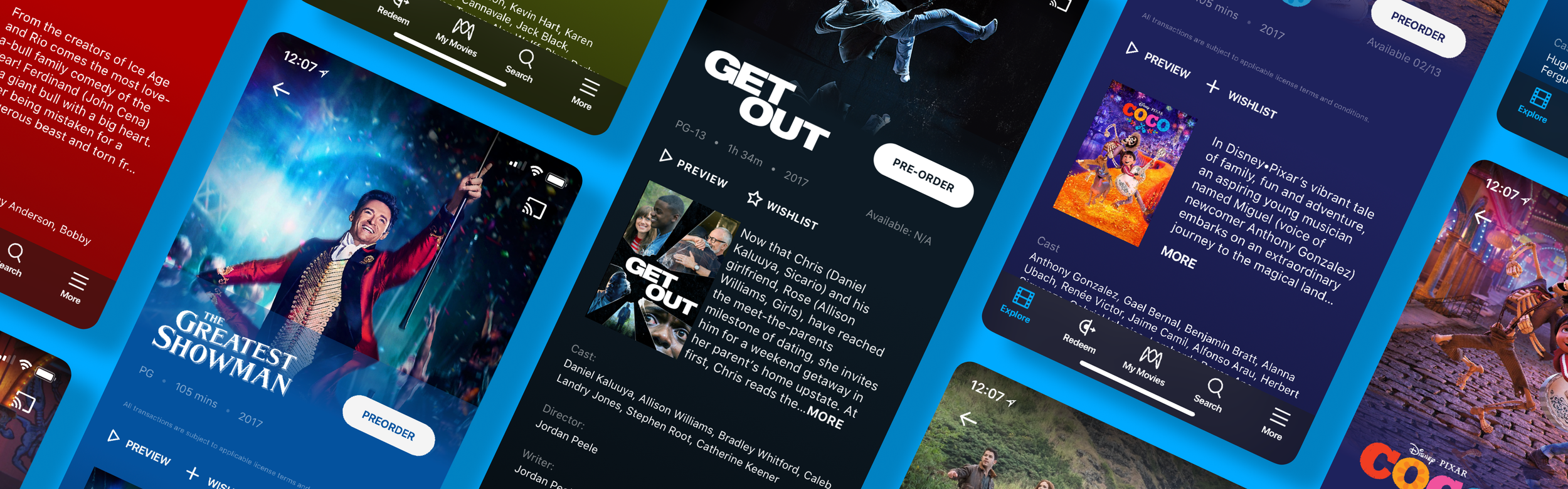
Movies Anywhere was designed with movies lovers in mind, so we wanted to make sure that our movie detail pages gave fans the visuals they’ve come to know and love from their favorite movies.
Title treatments
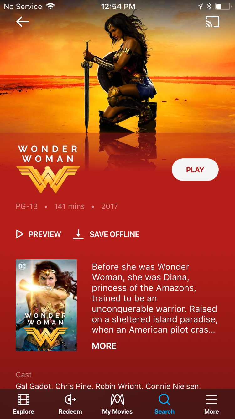
We had two ways of showing the name of the movie on the movie detail page— one option was to use plain text, which afforded us the most flexibility/scalability for the entire library of movies and the other option was to use a title treatment, which is the branded logo seen on movie posters, promotional materials, etc. Though the title treatment required more logic and stringent guidelines to utilize properly in our UI, it was the superior option to meet fan expectations and increase their excitement for the movie.

Text only

Title treatment
Color theming
After doing some competitive analysis on platforms like iTunes, we decided to apply custom color-theming to the movie detail pages for each studios’ recent tentpole movies to take them to the next level and make them feel really special on our platform. Because we were facing time constraints, we weren’t able to apply a programmatic solution like pulling the most prominent color from the hero image, so instead we worked with our engineering team to apply a gradient of two hex values spanning the height of the page. The two hex values were either pulled directly from a movie’s press kit, given to us directly by the studios, or colors that we proposed to the studio for approval based on the hero image and title treatment for a given movie.

Default background
Custom color theming
Embrace constraints
Taking on a design challenge of this size so close to the launch of what was already an ambitious cross-platform, multi-stakeholder product was a bold decision in and of itself, but it led us to innovate within constraints.
Auditing ingested assets
Because the product had previously been designed with a light grey background, many of the title treatment assets provided by the studios contained dark elements, which no longer showed up on our newly dark interface. Additionally, many of the title treatment assets were center-aligned rather than left-aligned, contained empty transparent space, were overly tall/narrow or wide/thin, and had effects such as drop shadows or glows which delivered undesirable results.

Original ingestion

In-app
Manually adjusting assets and asking for redelivery
We knew that the only way we could get buy-in from internal stakeholders and the studios to implement our design improvements would be to come up with solutions that had little to no impact on existing timelines and didn’t require a major lift from the studios to redeliver assets for 7,000+ titles. So, we narrowed our focus to 20 tentpole titles and about 75 recent, known titles that we manually vetted, adjusted wherever possible, and redelivered to our production team. For titles that needed larger adjustments, we worked directly with the studio creative teams to have those assets updated and redelivered per our new specs.

Title treatment tracker

Some readjusted title treatments
Create scalable solutions
Even as we took on the manual effort of bringing our vision to life ahead of our initial launch, we designed everything with scalable fast-follows in mind.
A tiered approach
After identifying our key challenges, we came up with a solution to create a tiered system where we could allocate the manual design time required to craft a bespoke experience for tier 1 and tier 2 titles while falling back to our default text movie names for the back catalog of tier 3 titles. We successfully got buy-in from our internal and external stakeholders with the understanding that we would work towards converting all tier 3 movies into tier 2 movies post-launch.
Tier 1
For key, tentpole titles, we display the title treatment along with a custom color-themed background. All tier 1 titles were designed by us and sent to the relevant studio for final approval.
Tier 2
For about 75 of the top, most recent studio titles, we display the title treatment on our default black background.
Tier 3
For the remaining back catalog of movies, we fall back to the text title on our default black background.
Post-launch process improvements
After going through the very manual and laborious process required to get title treatments ready in the short window we had before launch, we worked with our marketing creative team to write up new title treatment specification documents that we shared with the studios. Another bottleneck we uncovered while carrying Movies Anywhere over the finish line was the video ingestion tool used by our production team, so we fully redesigned that tool from the ground up and added support for many of things the team had been handling manually. This included features like robust QA tools, custom hex value support for movie detail pages, and more.

New title treatment specs

Video ingestion tool redesign
What people are saying

“And while apps for competing services have usually been clunky or awkward, the brief demo we saw of the Movies Anywhere app looked sleek and well-designed. Purchases made from the Google Play store on one device showed up in the Movies Anywhere library of another nearly instantly, and on an Android tablet the app’s interface called to mind the glossy look of Netflix’s latest UI.”
“But I love Movies Anywhere because I'm one of those collectors. Yes, the Criterion Channel is a great streaming service for discovering movies, but Movies Anywhere is the portable movie theater I always wanted.”